Bug - FormFieldGroupExpandable - Horizontal line overlap, when no header is defined. #12611

Description

Describe the problem
This is an issue with
-
Patternfly 5
-
Patternfly 6
-
other
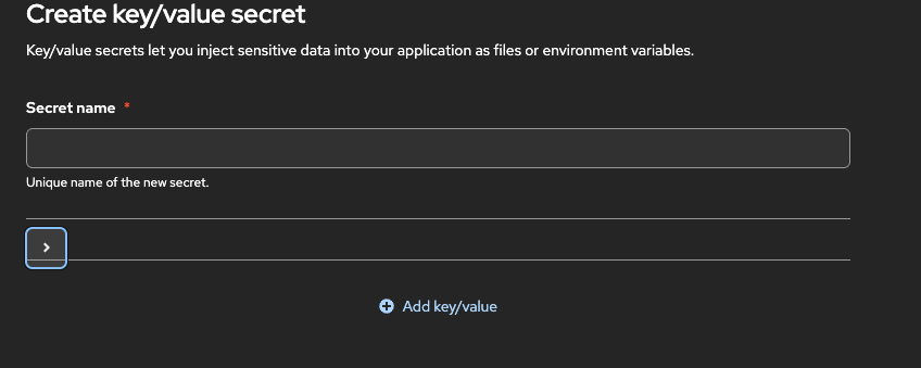
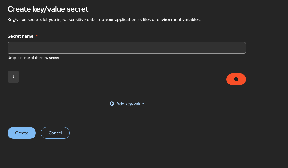
This is a CSS layout bug in PatternFly's FormFieldGroupExpandable component. When the optional header is not provided, the expand/collapse toggle icon overlaps with the component's top border.
The issue stems from how the component handles the absence of a header. The CSS styling appears to rely on the header's presence to create the necessary vertical space for the toggle icon (the caret >). When the header is omitted, this space collapses, causing the icon to be misaligned and render directly on top of the horizontal line.
How do you reproduce the problem?
https://codesandbox.io/p/devbox/boring-germain-98h679?workspaceId=ws_M4PEkPeCW7FD8LFeSHjZJQ
Expected behavior
The expand/collapse toggle icon should be vertically aligned and have sufficient padding to ensure it does not overlap with the component's top border. This alignment should be maintained even when the optional header prop is not provided, ensuring the component renders gracefully in all its valid configurations.
Is this issue blocking you?
No, this is a visual bug and does not block functionality.
Screenshots
(no header)
(just action button)
What is your environment?
This issue is likely independent of the environment and appears to be a component styling bug.
OS: macOS
Browser: Chrome
Version: Latest versions
What is your product and what release date are you targeting?
N/A
Any other information?
N/A
Jira Issue: PF-4528
Jira Issue: FELT-4625
Metadata
Metadata
Assignees
Type
Projects
- Status
Activity
mcoker commentedon Oct 14, 2025
cc @andrew-ronaldson, from the field groups design guidelines:
Can you or someone on the design side confirm this is the case or do we want to support the layout above with no title/description for an expandable field group? Looks like the title and description props are not required in react, and I'm wondering if they should be.
andrew-ronaldson commentedon Oct 14, 2025
I think the title at least should be required and Description could be optional. Side note: The field builder component group is the pattern we typically recommend for key value pairs. It should be on the main PF site any day now
github-actions commentedon Dec 17, 2025
This issue has been automatically marked as stale because it has not had activity in the last 60 days.
github-actions commentedon Jul 19, 2026
This issue has been automatically marked as stale because it has not had activity in the last 60 days.
jcmill commentedon Aug 4, 2026
Just dropping a note, this issue is likely to be moved to React and addressed as a doc update.
coderabbitai commentedon Aug 4, 2026
🔗 Related PRs
#12710 - fix(Form): document required field group title [open]
📝 Issue Planner
Check the box below or use the
@coderabbitai plancommand to generate an implementation plan and prompts that you can use with your favorite coding assistant.🧪 Issue enrichment is currently in open beta.
You can configure auto-planning by selecting labels in the issue_enrichment configuration.
To disable automatic issue enrichment, add the following to your
.coderabbit.yaml:💬 Have feedback or questions? Drop into our discord!
github-actions commentedon Oct 11, 2026
This issue has been automatically marked as stale because it has not had recent activity. It will be closed if no further activity occurs.