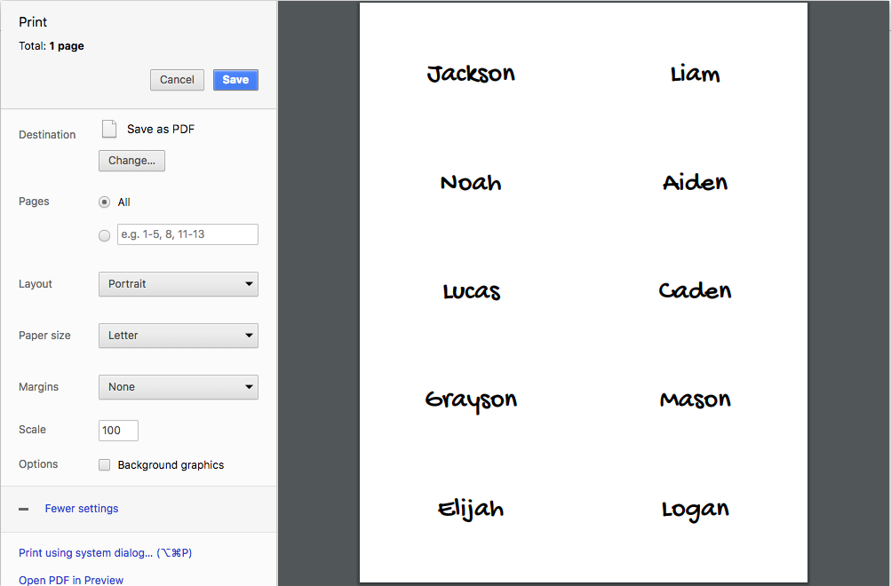
This library makes it easy to create labels which can be printed on-to a 10 label avery sheet.
Example:
import { StandardRectangle } from 'react-avery';

const { Layout, Sheet } = StandardRectangle;
This component by default renders a preview normally, and a proportionally accurate sheet for print media.
{
    selectedLocation: number, // 1-10
    selectLocation: (label: number) => void,
    LabelInsertComponent: ({ location: number, sheetId?: string }) => JSX.Element,
    className: string, // optional class names for Sheet wrapper
    style: object, // optional styles for Sheet wrapper
}
This component wraps Sheet to create a flex layout around it, putting form on the left and the sheet on the right. To accomplish this it takes form as its children.
Layout by default renders the SheetPreview normally and SheetPrintView during print media.
{
    ...sheetProps,
    children: JSX.Element, // Form for sheet labels
    className: string, // optional class names for Form wrapper
    style: object, // optional styles for Form wrapper
}
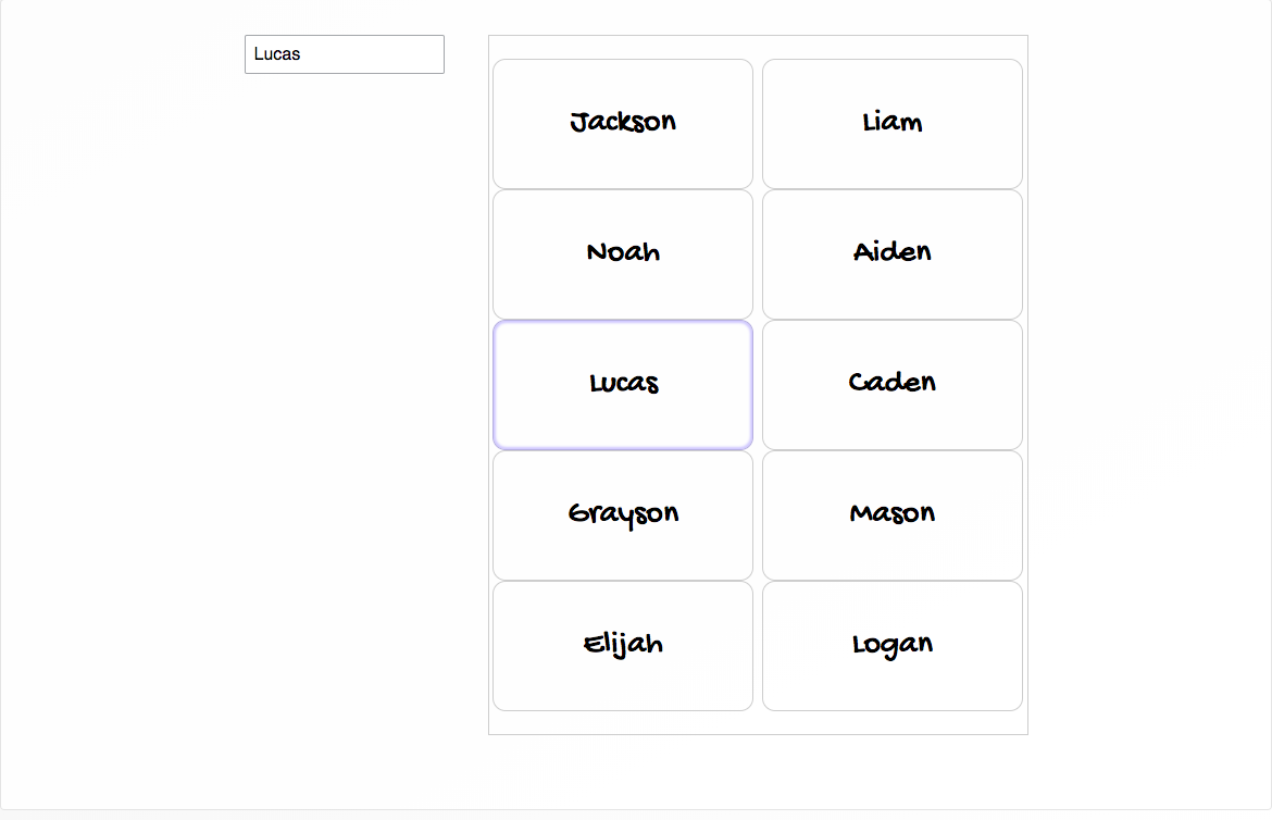
This component takes a label location and determines what to render for the label in that location. As you may have noted, sheet doesn't pass down any label state, so then how does LabelInsertComponent know what to render?
Have the requisite label state passed in from the top level, this source references the name tag story for this code base.
const NameStory = () => {
    const { labels, selectedLocation, selectLocation, updateLabel } = withLabels();

    return (
        <Layout
            selectedLocation={selectedLocation}
            selectLocation={selectLocation}
            LabelInsertComponent={({ location }) => <NameInsert {...labels[location]} />}>
            <FormOmitted updateLabel={updateLabel} />
        </Layout>
    );
};
In this example we use a react context to provide label state, and wrap the NameInsert in a consumer. The context provider code can be viewed here
export const LayoutContextProvider = (FormOmitted, LabelInsertComponent) =>
    props => {
        const { labels, selectLocation, selectedLocation, updateLabel } = withLabels();

        return (
            <LayoutContext.Provider value={{ labels, selectLocation, selectedLocation }}>
                <Layout
                    selectLocation={selectLocation}
                    selectedLocation={selectedLocation}
                    LabelInsertComponent={LabelInsertComponent} />
                    <FormOmitted updateLabel={updateLabel} />
                </Layout>
            </LayoutContext.Provider
        );
    };

export const withLabelState = LabelInsert =>
    ({ location }) => (
        <LayoutContext.Consumer>
            {({ labels }) => <LabelInsert {...labels[location]} />}
        </LayoutContext.Consumer>
    );

const NameStory = LayoutContextProvider(FormOmitted, withLabelState(NameInsert));
Ensure that react is installed globally, it's a peer dependency for react-avery
npm install -g react
npm run link-local
npm run storybook